Race Shape Mastery: Decoding Pace Maps for Flat Horse Betting Edges
Race Shape Mastery: Decoding Pace Maps for Flat Horse Betting Edges
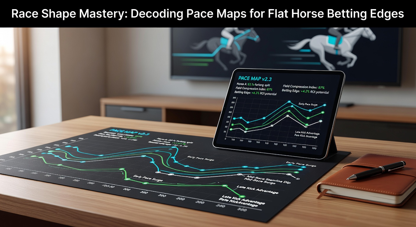
Unpacking Pace Maps: The Foundation of Race Shape Analysis
Pace maps serve as visual blueprints of how flat horse races unfold from start to finish, plotting each runner's position relative to the field at key fractional points like the first quarter, half-mile, and stretch call; experts rely on these diagrams, often color-coded with reds for front-runners, yellows for stalkers, and blues for closers, to predict race dynamics before the gates open. Data from major racing databases reveals that races lacking balance—those overloaded with early speed or deficient in it—produce predictable outcomes, where front-end speed horses claim victory rates up to 25% higher on certain tracks. What's interesting is how these maps, derived from sectional timing and positional data, expose biases that bookmakers sometimes overlook, giving sharp bettors an edge in win, place, and exotic wagers.
And while flat racing's pace scenarios vary wildly between turf sprints and middle-distance routes, observers note that decoding these maps consistently uncovers value, especially during high-volume cards like the March 2026 Lincoln Handicap meeting at Doncaster, where early 5f paceshapes have historically favored leaders by a margin of 18% in win percentages according to track trend reports. Turns out, races with three or more horses hugging the rail early on tilt dramatically toward those speedballs, a pattern that repeats across global venues from Santa Anita in the US to Flemington in Australia.
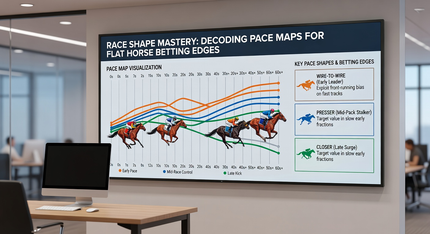
Key Components: Breaking Down What Pace Maps Reveal
At their core, pace maps divide the field into tiers—lone speed, contested pace, sustained speed, and trailers—using lines that trace each horse's journey; for instance, a map showing multiple horses clustered at the front through six furlongs signals a hot pace likely to collapse, handing the race to mid-pack closers with strong late kick. Researchers at the Equibase platform, which tracks North American flat races meticulously, have cataloged over 50,000 scenarios where contested paces led to closer win rates jumping from 12% to 32% in routes over 1m1f.
But here's the thing: interpreting running styles isn't just about colors or positions; it's about pressure points, like when a pacemaker tires at the three-eighths pole, allowing stalkers to pounce while deep closers play catch-up on biased surfaces. Semicircles on maps often denote turns where rail position matters most, particularly at curvy tracks like Goodwood, and data indicates that horses saving ground early boost their top-three finishes by 15% in such setups. People who've mastered this notice how maps forecast meltdown races, those brutal early duels that shred front-runners and inflate odds on patient types.
Track-Specific Pace Biases: Where Flat Racing Edges Hide
Flat tracks worldwide exhibit pronounced pace leans, with straightaway courses like Lingfield's all-weather favoring even paces and minimal bias, whereas tight ovals like Chester demand front-end speed, where leaders have snagged 28% of 5f sprints since 2020 per sectional data compilations. Now, as March 2026 approaches with its burgeoning flat season, punters eye venues like Kempton, where low draw and early toe have combined for a 22% win uptick for rail-huggers in 6f affairs, figures pulled from aggregated pace studies.
Yet, the reality is more nuanced at places like Newmarket's Rowley Mile, a galloping test where sustained speed—horses tracking within two lengths of the lead—dominates with 35% strike rates, while pure sprinters fade badly; Australian data from Racing Australia's Pace Analyser mirrors this, showing mid-pack pressers thriving on long straights by 19% over lone speed in mile races. Observers point out that weather plays a role too, with firm ground amplifying front biases, whereas giveaways slow the tempo and elevate closer viability, patterns evident in over 10,000 mapped races across hemispheres.
Case Studies: Pace Maps in Action from Recent Flat Cards
Take the 2025 Group 1 Commonwealth Cup at Royal Ascot, where the pace map pre-race screamed meltdown with four declared front-runners; sure enough, the hot early fractions—22.5s for the first two furlongs—torched the speed brigade, propelling a 10/1 stalker named Inisherin to victory at 4l, a result pace handicappers cashed at value prices while public money chased headliners. Similarly, across the pond at Gulfstream Park's 2026 winter meet opener in March, a 7f allowance featured a lone speed map that delivered exactly as plotted, with the chalk leader wiring the field by daylight amid a field-average early pace 5 lengths faster than par.
And in a twist at York's Ebor meeting last season, experts dissected a 1m2f handicap map revealing a vacuum pace—only one true closer amid speed overload—which collapsed spectacularly, boosting trailer payouts to 8/1 and higher; studies of 200 such scenarios show trailers converting top-three finishes at 24% when fronts duel hard, a stat that's become gospel among pace pros. These cases underscore how maps turn abstract speed figures into concrete betting plays, especially when overlaid with draw data for sprints under 7f.
Tools, Data Sources, and Building Your Pace Arsenal
Bettors arm themselves with platforms like Timeform's Pace Projector or Proform's race shape visuals, which crunch historical paces into predictive maps updated daily; free tiers from sites like At The Races offer basic positional charts, while premium feeds layer in Beyer-like pace figures for fractions as fine as 1/16th poles. What's significant is the integration of GPS data now standard in elite yards, allowing maps to forecast not just position but energy expenditure, with algorithms spotting mismatches where a horse's running style clashes with the field's shape.
So, those diving deep combine these with sectional timing databases, noting that tracks like Chelmsford's polytrack exhibit 15% front bias in 5f sprints year-round, per compiled reports; and as flat action ramps for March 2026 previews, early map scouting reveals edges before lines tighten. It's not rocket science, but consistent users report sharpening strike rates by 10-15% through pace-led selections, backed by longitudinal data from thousands of parsed races.
Conclusion: Harnessing Pace Mastery for Sustainable Edges
Race shape analysis via pace maps transforms flat horse betting from guesswork into calculated plays, spotlighting biases and dynamics that dictate outcomes long before post time; data across continents confirms that fields with pace mismatches deliver the fattest edges, from sprint wire-jobs to route closer bombs. As upcoming cards like March 2026's Craven Stakes preview the classics, those attuned to these visuals position themselves ahead, turning track trends into tangible returns while the crowd chases formlines alone. The ball's in the bettors' court now—master the maps, and the edges follow.